Adams Golf Redesign Presentation - Placing the Pieces.
“Driven By Innovation” is on Adams Golf logo.
Our goals in redesigning Adams Golf website are to reflect this inspiration with increased sales, name recognition and the understanding and relationship of how the Adams brand and product make for a better golf game.
The more the understanding and teaching of equipment and technique, the more fun and improvement the game of golf is for the customer and player - the better for Adams Golf.
Adams Golf - Redesign Goals:
• Improve Sales
• NO dramatic changes
• Eye always on the Customer
HOW to Accomplish:
• Ease of Navigation restructure Adams Golf main navigation to better categorize menu options with images that best represent that category.
• Add “ADAMS GOLF” Name/Logo to Navigation Bar
• Add Images to Main and Sub Navigation
• Add a “Juniors” category to the Main Navigation
• Better Connect Players to Product with instructional video from Players and Instructors
Adams Golf - Redesign:
Adams Golf Main Navigation
• Adams Golf Name/Logo
• Golf Clubs
• Women
• Juniors
• Complete Sets
• Accessories
• Players
Adams Golf Sub Navigation
• Image for Category
• Category Items
(Breakdown original categories to fit new categories -
add one image that best shows off that category)
(Presentation/Sales/Product Association Important)
The first thing you will notice with Adams Golf website is the consistency of the pages and the consistency of the navigation. The fluidity of the current design is already near perfect, therefore the structure of the pages should remain relatively the same in the redesign.
In this presentation we look at possible category changes, the addition of instructional media on certain of Adams' products, and a few placement changes of text items.
Three (3) Recomended Changes:
• Adams Golf Main Navigation modify navigation to add images of the most representative product for that page category
• Juniors Section add a Junior Section to the Main Navigation (we believe it should be a targeted group and product line Adams could capitalize with)
• Instructional Video add instructional video whenever possible promoting use of equipment and why Adam's products should be a required product
As Adams Golf is already a great website, so the changes should not be dramatic, with any transition or changes keeping the buyer in mind - as the goal is to "increase sales", not frustrate Adams' customers.
The Divine Proportion, Golden Ration, Rule of Thirds; this is a mathematical concept dating to ancient times that is used as a principle in almost all types of design from architecture to art to websites.
Although the exact origins of the formula and shape are not known, examples of its use can be found through history – Egyptians used the shape in the design of the great pyramids and Greeks used it for the Parthenon.
Perhaps one of the most famous examples of the golden rectangle appears as a Leonardo Da Vinci’s “Vitruvian Man” drawing, which was first published in “De Divina Proportione”. Parts of the shape, in particular the spiral, can also be found in nature; this shape is exemplified by the shell of the nautilus.
Applying some math dividing the whole by 1.618 or 1.62 gives you the Golden Ratio.
The article's conclusion: Using the golden rectangle will not ensure that your site design works as there are a host of other factors that contribute to a successful design.
The input form is an essential element of almost any website or application these days. Input is a core method of interaction, and in many cases it represents the hard conversion point between success and failure. With the amount time and effort we put into bringing users to our sign-up and contact forms, it’s surprising that we tend not to spend a proportional amount of time on the forms themselves.
A number of techniques and elements can be used in Web forms to turn them from abject failures into successful conversion points. In this article, we’ll present some interesting examples and useful guidelines for Web form design.
A Dash Of Quirkiness
Part of Web design is about communicating personality and being relatable, because people enjoy dealing with other people. One quality that almost always helps is a bit of quirkiness and fun. A small dose of friendliness and personality will make the input process a bit more enjoyable and human.
Jarad Johnson‘s contact form has a flavor of good ol’ post card. The visual appearance of the form makes it stand out from the usual generic forms found elsewhere. A very nice touch to an often forgotten element of Web designs.
Red Tiki‘s quirkiness is tied to the company’s brand and identity, but is powerful here nonetheless. From the frame motif to the wooden character peeking out, this form feels fun and approachable. Little colloquial phrases like “This lovely form” and “We’re always keen to lend an ear” are fantastic ways to make the company more relatable. The form is bursting with personality and flare, which helps the user complete the form and click the “Submit” button.
Applicom‘s form is a great example of how to be clean and professional without being sterile. Styling the form like a letter — with a stamp, subtle paper texture, striped edge and handwritten addressee name — may seem cliche, but it demonstrates a certain level of personality and care. Language such as the “Do: Be fine, use your real address. Don’t: Be negative, spam” may seem trivial, but it’s important. At the end of the day, it makes users feel like they are dealing with people who aren’t afraid to speak to them. Craftsmanship always indicates care and professionalism.
Sophie Hardach‘s form is another example of a post card idea implemented in a contact form. The input fields are a bit clearer than one would think, yet the “Submit”-button is a bit more difficult to find. In order to send the message, a stamp in the right upper corner needs to be dragged to the Stamp area of the form. In fact, the form is not only very original, but also accessible.
Two Paperdolls has probably the busiest contact form of all the forms featured in this article. However, the form fits wonderfully to the overall design of the page which is a “We Are Hiring” page for designers with strong focus on typography. Notice the clean real-time validation for the form: the error indicator is diplayed in the right upper corner of each input field. Too bad that the navigation through form fields doesn’t work properly with “Tab”.
Kontain uses a different kind of a date picker for letting users pick the date for the form. The designers have arranged the dates in four rows rather than displaying them all vertically. A nice idea for reducing the horizontal scrolling for the users.
Wopatas slider for the timeframe in their contact form is much different from the generic sliders, select-menus and radio buttons. This is a proof that filling in Web forms can be fun.
The language used on Fi is more friendly than formal. The inviting nature is reinforced by the short colloquialism for each form field that illustrates why the information is being requested. The language of labels should give off a little charm, without being insincere or overbearing. Isn’t everyone more engaged in a conversation if the other person is pleasant and approachable?
Some forms are boring, while some are beautiful. Idyllic Creative‘s contact form is remarkably simple yet beautiful. Another example of a design agency which integrated a character from their work in their contact form.
Egopop has a very simple, perhaps oversimplified contact form which however has a nice touch. The weird character on the right side plays wonderfully together with the other characters on the site and makes the contact form less boring than it would be otherwise. The contact form opens in a lightbox.
Tinkering Monkey‘s character on their contact page is another interesting example of how the contact form page can be made a bit less boring. Notice the FAQ area on the right side of the contact form. An excellent idea for helping customers quickly find answers to their questions once they feel lost and can’t find a solution to their problem.
Ditio‘s designers have decided to combine their sign up form and a contact form in a hidden sidebar box, very much like it’s often done with the fixed “Give feedback” buttons on the left or right side. Once a trigger button “Inschrijven” is clicked, users can sign-up for their account and even upload a CV. Notice that there is no textarea available for lengthy details.
Treehouse Editing’s contact form is another example of a quirky design with a clean and lean layout. When the user navigates to the page, the background changes to a spring theme, which is itself associated with making contact, thus encouraging them to fill out and send off the form. Notice that all that is necessary for initial contact fits into a couple of fields; further information can be collected in subsequent correspondence. Ask yourself whether a minimal layout would do the trick on your website as well.
Amazee Labs doesn’t have to do much to make its form usable and inviting. The form has only a few quirks, namely the texture, the “Hi there, let’s get in touch!” line, and the “Send It!” button. It may not seem like much, but the casual language, careful color choice and overall texture help Amazee Labs instantly feel like a friendly and easygoing bunch.
The motif of Wing Cheng’s website is an open sketchbook, with most of the sections designed as sketches and thumbnail drawings. The contact form maintains this personality and coherency by following the motif. The form is simple and appropriate. The thought diagram with the email address adds visual interest. Maintaining the hand-drawn style is what brings out the quirkiness. Imagine how jarring and uninviting this form would be if it was a default HTML field set stuck on top of a beautiful paper texture.
No one likes a humongous unending list, especially a list of elements to fill in or interact with. Just as a giant paragraph of text is daunting to the user, so is a giant block of empty fields. To coax the user to the finish line, the designer should make them feel like they are completing steps, or bite-sized chunks. Take a giant web project: trying to wrap your head around it all at once is almost impossible.
But if you break it down into goals, and then stages, and then sets of tasks, it becomes much more manageable. This is what we want in a Web form, especially if you’re asking for a sizeable amount of information. Keep in mind that you can organize a form simply by sectioning off parts of it or by arranging the content into columns.
Break It Down
Collison Labs‘s contact form might appear to be a bit too complicated at the first glance, but it’s quite straightforward. The left side of the contact page contains alternative contact information as well as a map which is designed with the overall design of the website in mind. On the right side, each input field is clearly represented and highlighted when the user fills out the form.
Visual Republic‘s choice of design for input field labels is similar to the solution by guys over the CollisonLabs. Giving the field label a solid background with an arrow to indicate where the text would need to be typed is a nice technique that could be used more often.
CSS Tricks's comment area is a great example of a well-organized, helpful and clean comments area. Notice how the “star” image in the text area fades away as the user types in some text in the form.
Barley’s Greenville‘s form for beer rating is an interesting example of how multiple sections can be combined to make the form intuitive and easy to use. Notice the arrow-like symbol between the first and the second section as well as various shades of the brown color within the form.
Blue Sky Resumes uses sections to make its extremely long form much more manageable. Standard headings and horizontal rules are used to divide sections. The designer was also careful to visually distinguish the different sections so that the form doesn’t look like a long list of fields.
Validate Clearly
Users will not spend extra time making sure they have given you all of the information you need. Many designers believe that form validation detracts from the user experience, but its effects are adverse only when done poorly. When validation is simple and clear, it merely offers alerts and guidance to the user.
Make sure that you clearly mark the problem and tell the user exactly what is wrong. The fastest way to kill the user experience is with generic error alerts that mean nothing to the user. People are more than happy to quickly fix an issue if it is pointed out to them plainly.
Moody International provides an excellent example for a contact form that nicely combines different types of contact information in one place. On the left, you’ll find a postal address along with a map, a phone number as well as the company’s email address. The right side is dedicated for more detailed inquiries and consulation requests. The form’s labels disappear once the user has provided their data.
Unfortunately, the form doesn’t have an instant real-time validation and uses JavaScript pop-ups to inform the users about their input mistakes. Besides, the map on the left side could be integrated a bit better by using zoom controls as well as search functionality provided by Google Maps.
El Passion is another example of a contact form that combines various types of contact information in a very compact and meaningful way. Real-time validation in use. The map on the left side could be zoomable, though.
Some forms are boring, while some are beautiful. Idyllic Creative‘s contact form is remarkably simple yet beautiful. Another example of a design agency which integrated a character from their work in their contact form.
Orlando Advertising‘s form beautifully integrates its branding colors in a clean and attractive Web form. The red borders might be misunderstood and could be used to visually highlight errors in the form, but instead validation errors are displayed once the “Submit” button is clicked.
Reinvigorate There are usually two essential elements to effective form validation: identifying the specific problem, and clearly marking how and where to fix it.
Reinvigorate uses an alert icon and a loud red outline to indicate the problem, and then it uses the side column to tell the user what’s wrong with the information. Moreover, the user gets a visual indication when the information is corrected. Being clear about the problem and not leaving the user in the dark make for a smooth experience.
GitHub‘s sign up form is as simple as its overall design, yet its beauty lies not in aesthetics, but in its functionality. When you enter your credit card details, GitHub automatically recognizes the credit card provider and visually highlights it in the form, thus providing instant feedback to the user. A wonderful example of invisible design.
Blue Sky Resumes (Revisited) The error alert is clear and specific. By specifically telling the user that their name is missing, the user is spared confusion and is able to find their bearings quickly. To reinforce this message, the name field is clearly highlighted and marked as required.
Interactivity
A form is an interactive part of a website or application. In general, people want to interact with elements that feel alive and that follow convention. Many forms have a slight indent, creating a slight 3-D effect, whereas other forms simply show a box outline to delineate form fields.
The key to any interaction is expectation and feedback. Make sure your forms react to user input, mainly by specifying the focus and hover states of input elements.
On Grooveshark, its styling of the focus and active element makes it clear which field is being interacted with. Besides, erors are displayed in a nice, helpful way while error messages are displayed at the top of the “window” using Ajax.
The design helps the user to maintain focus and to breeze through the form. It even makes it kind of fun, because the user wants to see a response when they click on or interact with an element.
Unlocking‘s checkout form is a nice example of how simple design can work very well with appropriate level of responsiveness. The input fields look nice, the hover state is very clear and the hints on the right side are helpful and unobtrusive. The contact form shows a subtle blue background when the user focuses on a field.
The form uses an additional color to highlight fields. As long as the interaction creates a noticeable effect, the form will be more usable. The highlighting is not as bold as on some other sites featured above, but still effective and interactive and perhaps even more usable.
The motif of Jason Long’s orm silently sits on the page, doing nothing, unless… well, unless you send it out. Jason uses an animated contact form which flips and changes as the message is being sent. An interesting, memorable tweak that makes the user experience just a tiny bit more interesting.
An effective Web form should get the user to cross the finish line. It might be a “Submit” button, an order confirmation button or a sign-up button. At the end of the day, the designer wants the user to hit that conversion point and be reasonably happy with their decision.
Make sure that the way of submitting the form is bold and specific. Where possible, use language like “Send email” or “Finish signing up”, so that the user understands exactly what the button will do
The Finish Line
On Squarespace, the designer has gone as far as to label the button “Finish & Create Site” and has also made note of its function just below. This page is especially effective because of the contrast: the layout is completely monochromatic, so making the button green puts more focus on completing the process.
BLITZ has come up with an interesting solution for their contact form. A content block appears in a lightbox and presents three different types of contact forms: inquiry about business, jus saying “Hi” and CV submission.
The forms have a similar appearance but have a different structure. In all cases, the user has a checkbox for email updates at the bottom as well as postal address under the form. One confusing bit is that the form fields get a red border when you type in your data. Some users might confuse it with error notifications.
Custom Bags HQ has tried to combine various content blocks within one context. The “Contact” link in the upper navigation leads to a page which contains both the contact form and the “About us” information. In our opinion, “About us” doesn’t really detract from the user experience, but it doesn’t enhance it either.
The link doesn’t feel right here, at least at the first glance. Interesting idea: the form contains a checkbox asking users if they are interesting in receiving an email newsletter. A smart handle to keep customers close to you and keep them informed about your updates and news in the future.
Clear Labels
Any interaction that we encourage must be as non-threatening as possible. After all, we are asking for personal information of the user. They are under no obligation to provide it. The first step to avoiding frustration and confusion is to use plain and simple language. Make it to the point and not flowery.
Make sure that you clearly mark the problem and tell the user exactly what is wrong. The fastest way to kill the user experience is with generic error alerts that mean nothing to the user. People are more than happy to quickly fix an issue if it is pointed out to them plainly.
Foundation Sixs labeling is effective because it streamlines the process and simplifies commitment for the user. The company boils each category of information down to one word.
The “Submit” button is also clear and straightforward. There is no confusion in the user’s mind. Another strength here is the balance between multiple choice and fill in the blank.
Bärnt&Ärnst‘s designers follow their minimalistic approach to design and provide all contact information such as postal address, phone numbers, email as well as a short form for user’s convenience. Often you really don’t need to require more information than that for the initial email.
Zoltan Hosszu‘s contact page illustrates how icons can be used effectively to indicate the purpose of input fields. The form itself is very simple and quite unspectacular, but icons as well as some subtle textures make it a bit more distinctive and interesting.
The labels in Orlando Advertising‘s form beautifully integrates its branding colors in a clean and attractive Web form. The red borders might be misunderstood and could be used to visually highlight errors in the form, but instead validation errors are displayed once the “Submit” button is clicked.
Stuck Axiom ’s “New business” contact form are short and concise. The simple language and clear labeling make the form non-threatening and easy for the user to fill out. Contrasting with the gray of the form fields, the “Submit” button is set off and accented in red, making it clear where to click.
With clear labeling, not too many check box options and predefined budget ranges,
Solid Giant can get back to a potential client with a precise offer. The “Submit” button is clear and straightforward, marking the end of an intuitive path through the form. All elements are described carefully, and there is no room for the user to misinterpret what information to enter where.
Joey Rabbitt isn’t a fan of lengty emails. The message of the textarea can contain at most 500 characters.
However, if the user would like to email Joey directly, he can use an email on the right side of the page. Joey also showcases the networks he is a member of as well as his current location. Notice how beautifully the content is designed by using icons and various colors of grey throughout the page.
Multiple Choice Vs. Fill In The Blank
Selecting items from a list is naturally easier than filling in a blank. A blank sometimes raises more questions than it answers, especially if the labeling is not clear or there are too many empty fields. The user may be confused by the format, the type of information being requested or how exactly to answer a question.
In general, a choice is better than a blank, especially with information that could be confusing, such as scope, budget, project type, etc. This is why most order forms do not require you to fill out every piece of information.
Pieoneers uses the fill-in-the-blank format in the left column for generic information, with established conventions for format and type. On the right, more complicated questions are in the form of drop-down boxes, letting you choose between broad options, so that there is no confusion or hesitation.
Information Highwayman cleverly combines multiple choice and fill in the blank. The empty fields are for simple bits of information specific to the user: name, email address, comment. These are all non-threatening and could not be formatted as multiple choice.
Questions related to services sought and budget tend to be more complicated. Giving user some options here simplifies the process of explaining what you’re asking for.
Facio Design‘s contact form is probably the most difficult contact form featured in this article, and rightly so. The choice of typeface and the font size is suboptimal as it is very difficult to read, especially on Windows. The designers have tried to mimic the appearance of a letter, but it doesn’t quite work here.
Perhaps a very simple, basic form would work better here. Please notice that according to some studies, using this Madlib style form design could increase conversion, but we believe that in this specific case aesthetics doesn’t aid the functionality of the form.
Conclusion
This overview covers a few simple best practices that you can apply to Web forms. Just remember to spend the extra time on your next website; many of these approaches are not hard to implement and will lead to much higher conversion rates, but they are often overlooked.
We spend so much time getting people to the door that we forget to make the door as inviting and useful as the path to it.
On computer systems where multiple users share disk space and system resources, each user is given a computer account. How does the system know who is authorized to access and use this account? The user enters a password.
If the user enters the correct password, access is granted.
When you first get your account, some computer systems assign a password to you and you can't change it, but on the vast majority of systems, including the UNIX workstations in the Naval Postgraduate School's Air/Ocean curriculum, it is up to the user to select a password for his or her account. Selecting a strong password is the single most important thing you can do to protect your information from unauthorized access.
Why worry about picking a strong password, I trust the people on my computer system:
Maybe you know all the people who have accounts on your system and you trust them. But consider this, if your computer system is connected to the internet, and almost all are today, anyone in the world who can connect to the internet can attempt to access your account by guessing your password.
All that is needed is your account name or id, and this information isn't difficult to obtain on many computer systems.
On computers running the UNIX operating system, the user names and passwords of all users on the machine are kept in a file on the system disk.
Many UNIX based computers allow any user on the system to look at the contents of the password file and make a copy of it.
Fortunately, the passwords in the file have been encrypted into ciphertext, but the algorithm used to encrypt the passwords is publicly known and is the same on every UNIX based machine.
The encryption algorithm is almost impossible to reverse, or decrypt - that is you can't take the encrypted password, pass it through an algorithm and come up with the original password in plaintext.
However you can pass a plaintext password guess through this publicly know encryption algorithm and then compare the ciphertext result with all the entries in the password file for a match.
This is what many crackers try to do on UNIX machines.
They get a copy of the password file, and automate the guessing process by using a program that runs a list of common passwords through the encryption routine, and compares the encrypted results to the encrypted passwords in the stolen password file for matches.
A cracker that is able to determine your password will have access to everything in your account.
The cracker can not only read any personal or confidential files in your account, but also modify or delete the files.
Once an expert cracker breaks into a single user account, many times they can exploit security holes in the operating system (especially on systems that aren't running the current version of the operating system) and break into the special account on the system that gives the cracker access to all accounts on the system.
This special account is known by many different names on different systems: root, super user, supervisor, manager.
But the end result is the same, the cracker has used a common weakness; poor password selection by an ordinary user, to become GOD on that computer system.
Daniel Klein conducted research on password vulnerablilty on UNIX based machines by collecting password files sent to him by system administrators.
He tried to crack the passwords using the encryption of likely passwords method described above.
He ran his password cracking program on roughly 15,000 passwords. Here is an excerpt from his results:
... 21% (nearly 3,000 passwords) were guessed in the first week, and that in the first 15 minutes of testing, 368 passwords (or 2.7%) had been cracked using what experience has shown would be the most fruitful line of attack (i.e., using the user or account names as passwords).
If you don't care about the information in your account, or anyone else on the system for that matter, here are a few tips to make it easier for crackers to guess your password.
• You can make a crackers day by using your account name or id as your password.
This requires no effort at all on their part. You could rearrainge the letters, like using your account name spelled backwards.
A cracker will try every variation possible on your account name or id because as described above, about 3% of all users choose their account name, or a permutation of it as their password.
Also picking a password that is 3 characters or less is good. Even a brute force, or systematic attack on 3 characters or less will take only a few CPU minutes to perform.
• Use some personal information about yourself.
A password that is your nickname, your last name, your first and last names put together is very easy to guess.
To make it just slightly harder, try the name of your wife/husband, pet, girlfriend/boyfriend, child ... you get the picture.
You can make it alittle tougher by spelling the name backwards, or some other variation, but these are very standard tricks.
• Personal information that has numbers isn't any better.
Try your phone number, social security number, student ID number, address, license plate number...
• Why not use words from science fiction or fantasy realm, mythology, movies, famous people, profanities or obscene words.
These are common passwords that a good cracking program will try if you want to make the cracker work a little.
A cracker doesn't want to do an exhaustive search of all possible passwords, it is much easier and faster to try your user name or id first, then common passwords or some personal information he/she has learned about you.
Remember a cracker only needs to break into one account on a system, then they can attempt to attack the supervisor account, and compromise the whole system.
• uSE BoTh UppEr and loWEr Case Characters, digits, punctuation, and !@#$%^&* characters (and not just as the last character of you password only) if your computer system allows it.
The more complex and random the password is, the harder it is to crack.
• You should try to choose a password that uses the maximum number of characters allowed.
On UNIX systems, the maximum password length is 8 characters.
As a minimum your password should be 6 characters.
On machines that allow upper and lower case, digits, etc. as listed in the above point, a brute force, or exhaustive attack of all possible 5 character passwords at a rate of 1000 password guesses per second will take 90 CPU days.
Increasing the password to 6 characters, the same brute force attack will take 23 CPU years. Use the maximum 8 characters, it will take 210000 CPU years,
• Change your password regularly.
As mentioned in the previous point, a determined cracker can eventually guess a password with a brute force attack.
If the password is strong and 7 or 8 characters, it is relatively "safe." But changing it every 6 months or every year is wise.
• Some of the best passwords are acronyms that are special to you.
For example, if you have a daughter named Mary who is 11 years old, a sentence you might easily remember might be: My daughter Mary is 4 + 7 !, which would create the acronym password MdMi4+7!.
Another might be: Three blind mice, See how they run, which would create 3bm,Shtr.
These create passwords that are essentially random but easy for you to remember.
• Be wary of people hanging over your shoulder when you type your password.
If you suspect someone of trying to get your password by watching you type it in, report them to the computer center or system administrator, and change your password immediately.
Don'ts:
• Don't use a word in the English dictionary or a minor variation on that word.
Good password cracking programs check the whole dictionary.
As computer CPU's get faster, more words can be checked in the same amount of time.
Many cracker programs now check not only the English dictionary, but several foreign ones too.
Some cracker programs also check all the dictionary words with a 1 appended, replace all s's with $'s, reverse the word's spelling, or capitalize the first letter of the word.
• Never tell your password to anyone.
On UNIX based systems, even the system administrator never, ever needs to know your password under any circumstance.
If you ever get E-mail from someone, even if they say they are the system administrator, asking for your password for any reason, report it to the system administrator or computer center.
This is a ploy crackers use to get passwords.
• Never write your password down.
If you choose your own password you should pick something that you can remember.
If a password is assigned to you, this may be tougher, but try.
Never send your password through E-mail, it isn't as secure as you might think.
• Don't use simple patterns of adjacent letters on the keyboard.
On the surface qwerty or asdfgh may seem random, but crackers check many of these patterns as standard practice.
A new trend in website design is the use of media queries, this is because of the amount of devices that can now access the internet all the websites need to usable on any device type. This is where responsive design comes into action, this is the process of discovering what device the visitor is using so we can change the design to adapt to the visitor.
If a visitor is using a desktop then the screen resolution is a lot more than on a smartphone, because of the higher resolution we can display more on the screen and increase the width of all elements. If the visitor is using a smartphone then we have a limited screen size so we may need to rearrange some of the elements to fit nicely on the screen.
What Are Media Queries
Media Queries are used by find out the current max resolution of screen and allow you to use different CSS for this state than normal CSS. This is what’s called responsive design it discovers what resolution the visitor currently has and responds to this by the use of Media Queries.
Alternatives To media Queries
Mobile apps: The problem with this is that it will take up a lot more resources to create the app than to just use media queries. There is also the problem of different device operating systems, if you want to create an app you will have to create a different app for iOS, Android, Windows Mobile, Blackberry…etc, media queries will fix your site on any device.
jQuery Mobile: his creates a HTML5 based website which can be used on all the most popular mobile devices. The problem with this is that it’s another system to keep maintained on top of your website.
Media queries mean you get to keep your original CSS file, it can be used on all the newest browsers and mobile devices, it’s easy to maintain and can be developed by your existing web designer.
This article has two (2) code snippets, one for the boilerplate media queries and another to add animation to your media queries.
First pick a device to change the layout in this example we are going to change the smartphone layout. We are going to change the width of the main element and the sidebar to be the same width so instead of being next to each other they will be on top of each other.
Example of the Snippet Code from the article.
Ad men in the 20th century took this aphorism (original thought) to heart. It wasn't enough to simply sell a product; the goal was to hook consumers and keep them coming back.
There is a lot to be learned in this article and book for designing your web page, and was especially interested in the following:
One day in the early 1900s, a prominent American businessman named Claude C. Hopkins was approached by an old friend with an amazing new creation: a minty, frothy toothpaste named “Pepsodent” that, he promised, was going to be huge.
Hopkins, at the time, was one of the nation's most famous advertising executives. He was the ad man who had convinced Americans to buy Schlitz beer by boasting that the company cleaned their bottles “with live steam” (while neglecting to mention that every other company used the same method). He had seduced millions of women into purchasing Palmolive soap by proclaiming that Cleopatra had washed with it, despite the sputtering protests of outraged historians.
But Hopkins' greatest contribution would be helping to create a national toothbrushing habit. Before Pepsodent, almost no Americans brushed their teeth. A decade after Hopkins' advertising campaigns, pollsters found that toothbrushing had become a daily ritual for more than half the population. Everyone from Shirley Temple to Clark Gable eventually bragged about a “Pepsodent smile”.
Hopkins was among the first to elucidate principles that even now influence how video games are designed, public health campaigns are managed and that explain why some people effortlessly exercise every morning, while others can't pass a box of doughnuts without automatically grabbing a jelly-filled cruller.
By taking advantage of a quirk in the neurology of habits. It wouldn't be until almost a century later that medical schools and psychology labs would fully understand why habits exist and how they function. Today, we can create and change habits almost like flipping a switch.
But there are historical outliers who seemed to intuitc or accidentally stumble into - these insights before anyone else. Hopkins created a toothbrushing habit by identifying a simple and obvious cue, delivering a clear reward and —most important —by creating a neurological craving.
Craving, it turns out, is what powers a habit.
When Hopkins signed on to promote Pepsodent, he realized he needed to find a trigger for its daily use. He sat down with a pile of dental textbooks. “It was dry reading”, he later wrote in his autobiography. “But in the middle of one book I found a reference to the mucin plaques on teeth, which I afterward called “the film”.
“That gave me an appealing idea. I resolved to advertise this toothpaste as a creator of beauty.”
Soon, cities were plastered with Pepsodent ads. “Just run your tongue across your teeth”, read one. “You’ll feel a film—that’s what makes your teeth look ‘off color’ and invites decay.”
All habits—no matter how large or small—have three components, according to neurological studies:
Cue a trigger for a particular behavior:
First, find a simple and obvious cue.
Routine the behavior itself
Reward how your brain decides whether to remember a habit for the future.
Second, clearly define the rewards.
Related Article:The Power of Habit How the history of toothpaste explains why you can’t lose weight. Slate
Creativity is often described as “making something that has value”. That’s one definition. Another one is “recognizing ideas and concepts and using them in solving a particular problem”.
Do People Visit Websites to Achieve Particular Outcomes?
Marketers often use “focus groups” or “segmenting by demographics” in order to gain better insights into how to sell their products better. This approach is wrong, according to Clayton Christensen, who is a Harvard Business Professor and an author of several best-selling books on marketing and innovation.
James J. Gibson, one of the most important psychologists of the 20th Century theory “affordances”, asserts that people view the world in terms of outcomes.
Relating this theory to web design, it is important to understand the best way to make a site useful for its visitors.
Use the Psychology of Persuasion to Make People do Something
Psychologist Robert Cialdini and his best-selling book “Influence – Science and Practice” states several principles which can be used to influence people no matter where they live. Some of them include “social proof” (a person is more likely to do a thing if he sees other people do the same thing) or “likeability” (we are more likely fulfill requests of someone we know and like.
Neuro Science Marketing
Specific to websites, brain wave analysis results concluded that 50% more concentration was required for participants on confusing sites. Sites should be designed to accomplish outcomes and eliminate unnecessary and “fancy” stuff.
Consumers dislike being reminded of money—so much that they will rebel against authority figures, according to a new study in the Journal of Consumer Research.
“When consumers are reminded of money, do they conform, shrug it off, or react against others’ attempts to influence them?” The researchers found that money reminders lead consumers to react against people who would normally influence their decisions.
In three studies, participants were subtly reminded of money by either working on a computer with a hard currency screensaver or by formulating sentences using money- related words. “Because money reminders boost the importance of consumers’ autonomy, those subtly reminded of money perceived the authority commands and off- handed peer opinions as threats to their autonomy, which did not occur among those not reminded of money,”
Specifically, the participants who were reminded of money reacted in opposite ways from authority figures or peers when it came to evaluating products. Conversely, participants who were not reminded of money followed commands or suggestions of authorities and peers.
“This reactance to social influences only occurs when money-reminded consumers made decisions for themselves”, the authors write. “When these consumers were asked to make decisions for a relatively intimate other, they were indifferent to social influences (i.e., the unsolicited opinion of another consumer).”
“This research highlights money’s ability to stimulate a longing for freedom, and has potential implications for interpersonal communication, advertisers, and markets”, the authors write. “Money cues are frequently present in the social environment (e.g., televisions spots mentioning savings or discounts, in-store signage with dollar signs, billboards advertising the state lottery). These money cues may function in the same way as money primes in our studies and lead consumers to retaliate against perceived influences on their behavior.”
University Of Chicago Press Story In: JCR Journal of Consumer Research
Fluidity Of Content And Design: Learning From Where The Wild Things Are
The storybook "Where the Wild Things Are?" has fluidity of content and design figured out. The Author Maurice Sendak doesn’t explain all textually for the reader, but lets illustrations work, and readers make the narrative connections for themselves.
The words and pictures depend on each other for completeness. Web designers can employ the same complementary dependence of graphic and text in their own work. It encourages a sense of belonging and can create strong first impressions, which are often essential to effective web design.
Four strategies for improving fluidity of content and design, and what we can learn from “Where the Wild Things Are”.
• With Graphics As Your Witness Effectively “backs up” content with graphics
• Tighten Up Segmentation, prioritization and clear labeling
• Check The Narrative Voice “A Case for Web Storytelling”
• Be Mindful Of The User Experience “Making Up Stories: Perception, Language and the Web”
Conclusion - As in “Where the Wild Things Are”, trust your inner child; it won’t steer you wrong - with essential elements of user control and delight.
Smashing Magazine Story By: Sarah Bauer Photo By: Where the Wild Things Are
When working with clients it is important that the work you produce is not just about how good or bad a design is - it is how the design fits into the wider spectrum of things:
• Does the design fall in line with the overall theme?
• Does this design “say” what needs to be said?
• Does the design fit the branding?
What is branding and why is it important? - Branding
• Should emphisize the unique service or product to offer
• Creates qualities like loyalty, memorability and familiarity
• Is the perceived emotional image (in its simplest form, has nothing to do with things like logos and stationary)
• Is the perception of the audience
• The ultimate goal is to win the hearts and minds of your consumers - called “brand recognition”
Why is branding necessary?
• Without branding, audience will lose sight and most times think of the product or business as a copycat
• No audience to lose without a brand
How designers contribute to brand consistency
• Design is only a small portion of branding
• Good brand design can help build a solid foundation for a brand
• Design should be consistent with the views and perception of the clients
• Color schemes and logos are really memorable and help create a good foundation or start of branding
High Dynamic Range-technique (HDR) can create incredibly beautiful pictures which blur our sense of the difference between reality and illusion.
In graphics HDR imaging is a set of techniques that allow a far greater dynamic range of exposures than normal digital imaging techniques. The intention is to accurately represent the wide range of intensity levels found in real scenes, ranging from direct sunlight to the deepest shadows. This is usually achieved by modifying photos with image processing software for tone-mapping. And the results can be really incredible; in fact, many artists and designers come up with some pretty fancy results.
How you take the picture - take the same picture at 5 different shutter speeds. One exposed properly, two under exposed at differing shuttering speeds, two over exposed at differing shuttering speeds (the reverse of the under exposed).
Import the pictures digitally into software such as Photoshop, and adjust the combined images.
Dark web designs are very popular and can have an elegant and creative appeal.
However, they are not suitable for every website and should be used only when appropriate.
With a dark design comes less readability, less appeal for most readers and less opportunity for conventional design elements.
A recent poll suggests that light designs are preferred by the general web-going audience by 47%. The main reason is readability. Most people don’t like viewing light text against a dark background on websites because it strains their eyes, making for a much less enjoyable experience.
By contrast, 10% of those surveyed said that they always preferred dark backgrounds for websites, while another 36% said that the best choice would depend on the type of website.
Dark Web Design Ideas with Great Art that Work:
Johnny Hollow/Sebastian Onufszak/Kubi/Black Estate/Lotus/Pro Blogger
Almost and compared on the same level as hoarding clothing, rotten food or live animals, "digital hoarding" may have some of the same psychological roots.
The definition of hoarding is accumulating items beyond the point of usefulness, and it typically applies to things like clothing or cats. However it can also pertain to digital files, a practice that is more hidden than physical hoarding.
“Digital clutter doesn't beget mice or interfere with walking around the house,” says Kit Anderson, past president of the Institute for Challenging Disorganization, a nonprofit in St. Louis, that studies hoarding behaviors. “But it's more insidious because no one else is going to insist that you get help.”
David D. Nowell, a neuropsychologist specializing in attention issues in Worcester, Mass. states “Digital hoarding is a huge problem. There is so much available storage, we don't have to make decisions anymore,” ... “The problem isn't that it slows down your computer—it slows down your brain,” he warns, since each of those photos, links and folders demands some mental energy.
Hoarding is officially considered a form of obsessive-compulsive disorder, but some hoarders also suffer from attention-deficit-hyperactive disorder. Some digital hoarders are driven perfectionists who don't know when to stop researching or collecting.
Professional organizers who specialize in technology issues offer these tips for conquering digital hoarding:
• Practice “zero email”.
• Declare “email bankruptcy”.
• Unsubscribe to every newsletter and mailing list you don't need or want immediately.
• Set your spam filter to block any regular emails you don't want to receive.
• Don't check your inbox continuously
• Don't copy and save documents; save Internet addresses where you can find them later, if necessary.
• Remember, people typically use only about 20% of what they save.
Health Journal - WSJ Online Story by: Melinda Beck
“So I’ve got a confession to make: When we started working on the new Boston Globe website, we had never designed a responsive site before.”
The entire Boston Globe team worked in a laboratory environment.
Choose Your Weapon
Before laying down a single pixel, there was an important decision to make: What design program to use? Interactive design was chosen - design would be done directly in the browser.
First was needed to establish the aesthetic and plan high-level pages - The Boston Globe, with lots of specific page templates and multiple iterations for each breakpoint - big questions had to be answered.
InDesign from Adobe was used after review of the “usual suspects”. “Most web pages are simply a combination of photos and text. And where Photoshop excels at manipulating images (but sucks at type) and Illustrator is exceptional at typography (but sucks with images), InDesign is built for both.”
InDesign’s internal logic parallels that of web design and development. Every new document begins with a grid. It uses type and object stylesheets that should be familiar to anyone who has used CSS, allowing you to change the characteristics of every headline (or object) from one master style.
Time for a Breakdown
Early designs aimed to answer big questions:
• What are the key breakpoints?
• What do major templates look like at each breakpoint?
• What do the header and footer look like?
• What content appears on the homepage, various section fronts, and article page?
• What’s the overall look and feel?
To figure out the breakpoints, the all star team surveyed the available devices; smart phones, dumb phones, tablets, laptops, PCs, etc, and set some limits. In the end, six breakpoints were chosen - heavily influenced by standard smartphone dimensions and the dominance of the iPad:
“It wasn’t just for this project; we’ve designed subsequent responsive sites the same way.” Starting at 960, “we designed downward. Every decision informed the one before it and the one after; we flipped back and forth between breakpoints a lot. As the Mobile First mantra suggests, designing for mobile was most instructive because it forced us to decide what was most important. And since we refused to hide content between breakpoints, the mobile view could send us flying back up to the top level to remove complexity.”
“The process felt a bit like sculpting. We started with a big block and worked our way down, paring as we went, giving the site its shape."... "Design had answered the big questions, freeing the development to take a layered approach, with a stylesheet that defined the base and then added more complexity (up and up and up) based on device-width and capability.”
Putting it into Practice
“The header is a great case study in designing responsively. Even though it was the first design element that we completed, the team kept iterating on it. We continually refined the design while Scott and Ethan rewrote the code to make it perfect for every situation.”
“The header needed to support The Boston Globe flag, search, weather, classifieds, account info, basic site utilities, not to mention the navbar, itself a world of complexity. The nav has eight standard sections that derive directly from the newspaper (News, Sports, Arts, etc.), plus Today’s Paper and My Saved List.”
“With so much content in each section and the multitude of subsections (each one has at least six), we designed a super-dropdown in the navigation that allows quick access to top stories and subcategories within each section.”
Benefits of Designing in Browser
“Only a masochist could enjoy producing page after page of comps just to show a simple link state or a dropdown animation. I can’t tell you how many times I thought I had things like that figured out only to throw it away once coding commenced. All that time is better spent just coding the behavior.”
“And in the end, your design isn’t an accurate representation of the final product — it’s not usable. You can’t place it in front of users and get much feedback of any value (unless you like to let users dictate your color scheme).”
“It’s also easy to leave things out of a static design. What happens when the user clicks here? What happens to the design between these breakpoints? In code, you’ve got to answer these questions. With static pages, it’s easier to ignore.”
Getting to the Browser
As soon as the big design questions were nailed down - code began quickly. “Here’s generally how things worked:”
• “Upstatement discusses requirements with Miranda and starts designing”
• “Each week, the entire team meets at Filament’s offices to review the latest comps and ask questions”
• “We do a round of revisions based on feedback”
• “Filament Group takes the comps and starts to code”
• “At weekly meeting, group reviews coded comps and asks questions”
• “Rinse"
• “Repeat”
“This is what Ethan refers to as Design-velopment. (Yeah, we still don’t have a better name.) The heart of it is really in the conversation, the discourse between design and code. Everyone around the table was an excellent designer, and we all made contributions in different ways.”
I found this article to be typically excellent (and wished I could have been there). A great article to use for building the first level of the sitemap for the Boston Globe (which I choose to draw up), and for sitemap and wireframe for Adams Golf.
Upstatement Story By: Tito Bottitta There are 41 cites in this article a must read.
Responsive Design - Graphic Design Studio With Inspiration
The website draws-in more than a hundred thousand design enthusiasts a day and almost three million a month. Contributors from Brazil and the USA, and readers from all over the globe.
The black and yellow unique website showcases the design portfolio of Abduzeedo with a responsive designed website.
Abduzeedo's blog includes tutorials on Photoshop, Illustrator, other softwares like Pixelmator, Fireworks, and web design...
Founded in December 2006 by Brazilian designer Fabio Sasso, Abduzeedo (self described as what began as a means for backup after an ugly robbery), is now one of the design world’s most sought after blog for inspiration and tutorials.
A content prototype is an HTML-and-CSS-based fluid-grid, consisting of layout, typography and content.
For centuries, layouts and typefaces have been shapped according to the meaning of the content. This has traditionally been done on fixed-width pages. Inherited fixed-width mentality has been used in designing for the Web, but the fact is the Web is not fixed-width.
Media Queries are where users come to websites for content (usually by many different means). We should strive to present this content in the most appropriate and readable way possible.
Following the principles of content-driven design, start with the highest-priority content on the page (the real content). Don’t worry about anything other than the typeface, font size, column width and layout. Make it a pleasure to read.
Next, code using a fluid grid. This is critical; the content prototype should look very much the same on all canvas. Make informed decisions where media queries should fire. Using this method, the content will dictate where fluid grid breaks down. These breakages are where apply media queries should be applied (they are opportunities for more dramatic changes). Changes should always focus on the legibility of the content.
Following this pattern, you would add media queries at points where the fluid grid falls apart. Soon, you will have a full spectrum of resolutions, with beautiful and appropriate reading experiences. Once this is done, you will have a finished content prototype that demonstrates the readability of your content outside of the context of any device-specific resolutions.
Content prototyping lets you experiment with layouts before fully committing to a change for a given resolution.
The point is to make content more readable, independent of what device it’s being viewed on.
With over 4 billion mobile devices in use around the world, we can no longer assume that our sites will be viewed on a desktop monitor with an average resolution.
Instead of building separate sites for each device, we build one site that adapts to each device. The current approach to responsive design is still based on a few popular devices and, as a result, is likely to become obsolete as fast as they do.
Theory being, what if we could create a truly universal design that was device independent – one that, no matter what device you viewed it on, looked like it was designed just for that device?
Device Resolution: there are thousands of different devices with millions of potential contexts. All cannot be supported, so a few popular devices are chosen - basing designs on their resolutions, and ignoring the rest of the products on the market. When technology moves on and resolutions increase - sites will look outdated.
Pixels: Pixels sizes are not constant - or at least the display of them is not. 16px text on an iPhone can be -60% the size of 16px text on a Macbook. Basing designs on pixel measurements creates inconsistency in viewing size across devices and can negatively affect readability and usability.
Device Doesn't Matter: In practice, it means starting with the most common form of content, the paragraph element, and building up to a full layout. The manufacturer or the user has already set the browser’s default size for readability, it is suggested default sizes not be changed without good reason.
Basing the entire design on a base font size (using ems), as the format increases or decreases, so will the design. Using ems allows designs to be resolution independent.
Max-width to set the line length of the paragraph should be used for readable. This will vary from font to font, it is suggested something around 30em usually works best. This sets the width of your single column layout, making it “just right” for readability.
Responsive design requires a new way of thinking with a lot of discussion and exploration on “best practice”.
Design By Front Story By: Chris Armstrong
CSS Tricks - Different Stylesheets for Differently Sized Browser Windows using “resolution dependent layouts” Design by Front - Google Search
CSS Tricks - Different Stylesheets for Differently Sized Browser Windows using “resolution dependent layouts”
There is a W3C standard way of declaring “resolution dependent layouts” meaning rearranging CSS files for a website to take advantage of the size available. One way is to test the “device-width”, like this:
The top level code supports “media queries” and will apply the 800.css styling to the document only if the device viewing it has a width of 800px or wider.
The second level code and will apply styling to the document only if the device viewing it has a width between 701 and 900 pixels.
Alternatively, with “raw” JavaScript that still works great today (left), the windows width can be tested and change the active CSS file accordingly, and will work across all browsers.
The adjustStyle function will change the href value of the stylesheet. The browser will see that change and unapply the old CSS and reapply the newly linked CSS, and anytime the window is resized thereafter.
See the video in the CSS Tricks article in testing different browsers.
My Dog with Nephews and Flying Squirrels at the Ballpark in Arlington
My first entry into an art exhibit of any type, this being TCCD Student Art Exhibit. It is my understanding the exhibits are to promote culture and art, perhaps this goal could be in question with this entry.
What I learned:
• Do not wait until the last day to submit your work
• Formatting your Project for Print Media Requirements
• How to properly ask and oversee your Project be Printed
• Formatting your Project for Digital Media Requirements
• Organizing your Project to meet all the Requirements of Submission
• Buying Supplies
• Submitting your Project
It is best not to live in a vacuum - you never know unless you make the attempt.
40+ Vector Characters Adobe Illustrator and Photoshop Tutorials Noupe
40+ Vector Characters Adobe Illustrator and Photoshop Tutorials
Growing up, I lived more in the Leave It to Beaver era, with my younger brother being about the same age difference as Wally and the “Beave”, only I was the Beaver character not my younger brother, and always in innocent trouble - always grounded in my room.
This is where I learned how to draw with pencils paper and colored inks. Drawing such things as scenes in RatFink.com, Jules Furn adventures and George of the Jungle with a picture of Lawrence Welk and bubbles in the tree house in colored inks.
(such as these from the Internet) - only there was no Internet in those days, just your imagination.
Other than one year in high school where I took art as an elective, I had no formal classes in drawing, as my schooling was on the business side rather than the arts.
However, I was fortunate enough to have 10 years of piano and band combined, teaching me the disciplines needed through life. (My piano teacher's (Mrs. Baughman) husband played with John Phillips Sousa her breath was “minty fresh” (this was not in a good way)). Somehow she had a sixth sense, and knew if I missed even one day of practice. The music stick to keep time could also be used as a stick on the hands, and I'm thinking her motto was to “speak loudly and carry a small stick!”. Now-a-days it would be called child abuse, but back then no one was on my side, and it sure made me good at playing the piano.
----
To draw the dogs above, I started with a sketch on paper, scanned it in to the computer, then traced the sketch into a layer in Photoshop.
Then I traced the different color parts separately as paths, inserted the paths into different layers and filled with colors and effects, which gave me good practice with the pin and brush tools.
As this is my second semester in the graphics world, I have a lot of “learning to do” and found this article most helpful knowing how to make my characters better - meaning learning Illustrator.
Here are a few of the pictures I took and put together in Photoshop from my assigned project in digital photography - which was to create five (5) montage-collage pictures. For me, research consisted of looking at examples of actual pictures from varying artists to “How To” on Youtube for techniques. Research below:
Great Photoshop Tutorials to Create Montage Effects:
Out of Bounds Effect:
Montage-Collage for Ideas:
Digital photography project: I have been assigned a project in digital photography to create five (5) montage-collage pictures in photoshop. For me, research consisted of looking at examples of actual pictures from varying artists to “How To” on Youtube for techniques. I have included some of my research above.
Youtube is a great place to find tutorials on almost any particular project one would like. I especially found the tutorials made from the British quite “bloody” good. Sometimes you may find a tutorial in a language that you are unfamiliar, and in most cases the tutorial can be paused, and the frame can be matched up with the photoshop event, and may require experimentation to find out exactly what is going on to make it work for you.
Want to trick up your photos, how about making a puzzle. After some research on the web, Adobe has a plug-in turning pictures into puzzles.
To install, scroll down to Puzzle Effects and click the download button. This link will send you to PanosFX.com (Jigsaw puzzle effects for Photoshop & PS Elements).
Before installation read 4: ADDITIONAL INFORMATION & SUPPORT: Installation Tab. You will need to create a folder to hold the file "PFx_PUZZLE EFFECTS.atn", which will include several folders hierarchically above this file. For my purposes, I created a folder named “Adobe Photoshop Plugin Puzzle” in the Applications folder on my Mac (this file will be used for creating the puzzle effects in photoshop).
Follow the tutorial to load the “.atn” file into your photo.
Once loaded, a “Puzzle Set” folder is created with the number of layers selected as puzzle pieces. You can then take these layers and move or rotate to look like an incomplete puzzle.
Textures are very important is photographic manipulations, and used properly can create great effects. Here are some eye catching photoshop tutorials on how to.
The photo was taken by Doisneau in 1950 for Life Magazine to capture shots of couples in Paris. Its popularity happened years later, when a publisher asked Doisneau in 1986 if he could use the photo for a poster.
Although it is possible to shrink things proportionally and rearrange elements as necessary to make everything fit (reasonably well) as a screen gets smaller, but making every piece of content from a large screen available on a smaller screen or mobile device isn’t always the best answer.
Best practices for mobile environments: simpler navigation, more focused content, lists or rows instead of multiple columns.
Responsive Web design shouldn’t be just about how to create a flexible layout on a wide range of platforms and screen sizes. It should also be about the user being able to pick and choose content.
A few years ago, flexible layouts were almost a “luxury” for websites, and flexible designs weren’t really that flexible.
With the ability to easily show and hide content, rearrange layout elements and automatically resize images, form elements and more, a design can be transformed to fit a huge variety of screen sizes and device types.
As the screen gets smaller, rearrange elements to fit mobile guidelines; for example, use a script or alternate style sheet to increase white space or to replace image navigation sources on mobile devices for better usability (icons would be more beneficial on smaller screens).
SmashingMagazine.com
Responsive Web Design - What It Is and How To Use It Smashing Magazine
Responsive Web Design - What It Is and How To Use It
In the field of Web design and development, we’re quickly getting to the point of being unable to keep up with the endless new resolutions and devices.
Responsive Web design is the approach that suggests that design and development should respond to the user’s behavior and environment based on screen size, platform and orientation.
As the user switches from their laptop to iPad, the website should automatically switch to accommodate for resolution, image size and scripting abilities. In other words, the website should have the technology to automatically respond to the user’s preferences, which would eliminate the need for a different design and development phase for each new gadget on the market.
A few years ago, flexible layouts were almost a “luxury” for websites, and flexible designs weren’t really that flexible.
Creating fluid grids is becoming a fairly common practice. There are a number of techniques for creating fluid images:
- How to determine the best exposure for a specific photograph with film and digital capture
Coordinating colors with light is both important in photography, web design, and the look of professionalism. This is a great article in the thought process of taking not just a picture, but rather a great picture.
Additionally this website is structured with black, white, golds and greens - with the look of a professional site. I would like to take take pictures one day, place such photos correlating with events and to explanations of these methods, as such found in this article on the web.
There is not a person viewing this site that would not want to be at the Zion National Park taking these pictures.
(well maybe a few would not, but I sure would)
Too much television, leaves you with an empty mind, is what I see whan I look at the above image.
Sven Prim is a Swedish photographer/retoucher. He describes him self as a real technology geek who loves to create strange and surreal situations. His work has appeared in magazines and commercials.
Many people think that a photographer’s truth is compromised when the photographs are retouched, Sven disagrees with this. He sees the concept of truth in a completly subjective way. He believes that a picture is always manipulated, regardless of how it’s taken. When the photographer selects the time and place to snap a picture, the truth is already being bent.
The article mentions text heavy articles are often ignored - therefore, the point of this article is working with non-fixed layouts which can be more difficult once you introduce fixed-width elements into them.
1. Typekit.com allows you to sign up for an account (there is a free option to get you started)
2. Add a small chunk of JavaScript provided by Typekit to the head element of each page on your site. (this links your site to your account)
3. Browse fonts on Typekit, and choose the fonts you want to use.
4. "Publish" from within Typekit's popup editor to associate these fonts with your site.
5. Add definitions to your CSS and/or HTML to show the Typekit fonts. Save.
6. Preview your site in a browser
Once satisfied with your font choices, the new fonts display to everyone browsing your site. You have nice accessible HTML with new and distinctive typography. The fonts respond to all the normal CSS definitions, which means you can change size, colour, letter spacing, and so on through your CSS as normal.
Adaptive Images for Responsive Designs - Fluid Images
The article mentions text heavy articles are often ignored - The point of this article is working with non-fixed layouts which can be more difficult once you introduce fixed-width elements into them.
In an article published by Richard Rutter a series of experiments with max-width and images, it was determined to use a max-width: 100% as best practice.
Instead of rendering the image at its native width and overflowing its containing box, the image will render at its native dimensions as long as its width does not exceed the width of its container.
In this example, Javascript and an AlphaImageLoader (spacer gif of 1x1 pixels) tackel the issues with incompatablity between brousers - specifically versions of Internet Explorer (prior to version IE8).
Lots of small things can ruin your day while learning Photoshop and other parts of Adobe® Creative Suite®.
Today, it was something as simple as my cursor appeared as cross-hairs. Using many short-cut keys on the PC for years, and converting my hands and mind while learning the Mac short-cuts; for me, I am always clumsily using the wrong command-control keys causing all types of miss-keys.
When my cursor appeared as a cross-hair, I thought I had changed a cursor default. Therefore, I reset some of my preferences, but that did not work. Searching the Internet for my problem, I found my answer in this article - my caps lock key was on.
Beating Borders: The Bane of Responsive Layout Design Shack
Beating Borders: The Bane of Responsive Layout
An article just in time for our conversion from fixed design to responsive design.
Responsive Math Do the math and this adds up: Great explanation of percentages with graphics and the thought process to calculate column widths with borders.
The Border Problem Not between the states and Mexico. Rather this article points out the compatibility issues across Internet browsers, pointing out many headaches and solutions.
Color theory that is believed to be first written about by Leone Battista Alberti in the year 1435 and appeared 55 years later in the journals of Leonardo da Vinci.
In the 20th Century, industrial chemistry, expanded the range of color through the creation of synthetic pigment which allowed for improved saturation in color mixtures. These were used as an affordable means to take color photography and the most effective color combination became CYM (Cyan, Yellow, and Magenta) and also CYMK (Cyan, Yellow, Magenta, and Black).
In the late 19th Century the primary colors shifted to RGB (Red, Green, and Blue Violet) which became the primary colors in additive color mixing. Research showed these primary colors had differing responses to light by the three types of color receptors in the retina of the eye.
Color Matters explains the meanings and uses of colors.
• Red The color of extremes - the color of passionate love, seduction, violence, danger, anger, and adventure.
• Yellow The most luminous of all the colors of the spectrum - captures attention more than any other color.
• Orange A polarizing color - vibrant, hot, healthy, fruity and engaging – but can be abras
• Blue The favorite color - nature’s color for water and sky, compared with heaven, cold, wet, and slow.
• Green Not just a color also a verb - the color of growth, rebirth, and fertility.
Purple The most powerful wave length of the rainbow, rarity in nature and the expense of creating the color and has given purple a supernatural aura for centuries.
•
Pink Combination of the color red and white - stereotyped with girls in almost every culture.
Logos designed, with the name in mind. One more thing to keep in mind, always have a secondary design with a white background for letterhead and print - remember ink is king.
Below are a few logos from the article that I brought into photoshop and changed the background to white:
(Load downloaded image into photoshop, duplicate layer, magic wand tool (check off continuous box, and adjust the tolerance needed for selection on the top menu) to make selection,
save selection(select/save selection - name the selection) which loads mask as a new alpha channel.
On the channel tab: click off all RGB channels - click on saved channel
On the layers tab: click on duplicate layer, click add vector mask
On the channel tab: click on all RGB channels, click off new channel
In the mask section of the duplicate layer, use the brush, clean left over color if needed (white reveals - black conceals).
In the duplicate layer flip the background color.
Everyone needs a great and simple logo. Often the best logos are the simplest.
Steps to consider in developing logos:
• Creative Brief
Interview and brainstorming process on how the logo represents both the Name and the Image
• Drafting and Development
Sketching several Logos in Pencil
• Refining the Logo
Adding color and hardness to the sketch(s) using a graphics program
• Finalizing the Logo
Adding graphics and color with versions of color combinations
webdesignerwall.com by James White
Email Disclaimers to Protect Your Organization Tech Soup.org
Email is an essential business tool that not many organizations can do without. However, after several high-profile lawsuits with multimillion dollar penalties concerning the contents of emails in the corporate sector, nonprofit organizations, too, are increasingly aware that simply by using email, they may be exposing themselves to a number of legal threats.
One of the ways these legal risks can be minimized is by adding a disclaimer to every email that is sent on or from the organization’s email network. This article discusses why email disclaimers are needed, the different types of disclaimers that can be used and how to add them.
The disclaimer can help your case and, in some situations, might exempt you from liability. More importantly, it may well prevent the actual occurrence of lawsuits against your organization, since the mere presence of the statement might deter most persons from seeking legal compensation from your organization. Disclaimers are also used to prevent persons from unlawfully forwarding or copying confidential emails.
A suitable disclaimer could protect you from this kind of liability:
• Breach of confidentiality a disclaimer that warns the content of the email is confidential, you can help protect your organization against the exposure of confidential information. If the receiver breaches this confidentiality, they could be liable.
• Accidental breach of confidentiality if a wrongly addressed email is forwarded to a postmaster, who might not be authorized to read the email, or if an email message is intercepted - if anyone receives the email by mistake they are bound to confidentiality.
• Transmission of viruses should you send or forward an email that contains a virus, you can be sued for this.
• Entering into contracts written communication, including email, can be used to form binding legal contracts - include a statement that any form of contract needs to be confirmed
• Negligent misstatement by law, a person is obliged to take care when giving advice that a third party relies on - giving professional advice in an email, you could be liable for the effect of the advice that the recipient, if reasonably relied upon.
An explosive growth in palm-sized internet browsing has introduced new challenges for web designers. The fluid grid, a system in which the size of a website adjusts in proportion to screen specifications, does not provide enough flexibility for the smallest screens.
The popularity of mobile internet browsing has escalated dramatically over the years, and shows no signs of slowing down. New developments have generated unique challenges for web designers. Responsive design provides the ability to stay ahead of the curve, and the freedom to create beyond the constraints of device limitations.
Sites and Cites in this Article:
• Bootstrap, from Twitter - Simple and flexible HTML, CSS, and Javascript for popular user interface components and interactions.
• Clean Air Challenge - Images move gracefully from a horizontal arrangement to vertical.
• Bill Brown - Optimization of space occurs by a shift of image placement.
• Fork CMS - Graphics take a back seat when less space is available.
• More Hazards - Repositioning the page elements can make all the difference.
eXtra Normal (If You Can Type, You Can Make Movies)
Xtranormal is a website that hosts:
Xtranormal was originally intended as a way for filmmakers to quickly produce storyboards, its emphasis shifted towards satires of workplace misbehavior after one of its videos went viral.
You can Build your own Videos:
• Choose from Hundreds of Actors you control their emotions, voices and gestures
• Type of Record You Dialog actors automatically lip sink to your words
• Select Your Backgrounds pick camera angles, sound effect and more
Years of being around software, fat figures on the keyboard, and the always mind forming sentences before the fingers catch-up, have all taken a toll on my spelling ability. Therefore, I always “try” to use spell check (that's an oxymoron - “try” should not be a part of the English language - only “do” or “fail” IMHO).
That is to say, whenever possible I use spell check, this quick article shows that you should always proof your work as spell check may change the word and meaning of what you are writting.
Released on the 2nd February, the CSS3 Test, created by web standards aficionado Lea Verou, offers a quick and easy way to test and compare browser support for CSS3.
What the Test Includes:
• Backgrounds and Borders
• Image Values and Replaced Content
• Selectors
• Media Queries
• Basic User Interface
• Transitions
• Animations
• 2D Transforms
• 3D Transforms
• Text
• Fonts
• Color
• Multi-column Layout
• Values and Units
In the article, current release versions of major browsers (tested on a Windows PC) show:
The Adobe Museum of Digital Media (AMDM) is a unique virtual space designed to showcase and preserve groundbreaking digital work and to present expert commentary on how digital media influences culture and society.
The building itself was designed by Italian architect Filippo Innocenti, a master of fluid urban designs for large, public installations. Innocenti collaborated closely with award-winning designer Piero Frescobaldi, who served as the “building contractor” for construction of the virtual space. Adobe is proud to serve as patron on the project.
The museum's first exhibit features work by Tony Oursler, an internationally recognized artist who uses a synthesis of digital mediums — sound, light, video, installation, performance, and electronic entities — and often incorporates human faces.
The AMDM's second exhibit features work by John Maeda, world-renowned graphic designer, visual artist, and computer scientist, and president of Rhode Island School of Design.
Adobe Museum of Digital Media on Display:
Adobe Museum of Digital Media (AMDM)
FAO Schwarz Celebrates 150th Anniversary by Presenting Gallery of Historic Toys FAO Schwarz
FAO Schwarz Celebrates 150th Anniversary by Presenting Gallery of Historic Toys
Commemorative Exhibit Features Dozens of Timeless Playthings - From a 1905 Richard Steiff Teddy Bear to a 1976 Hello Kitty Plush Toy - Provides Visitors with a Look Back in Time at the Legendary Toy Store.
Generations of kids have found their most cherished playthings on the shelves of FAO Schwarz, and the retailer has served as the launch pad for many iconic toys and games throughout the years. Now, FAO Schwarz is showcasing more than 25 vintage versions of toys ranging from a 1905 Richard Steiff Teddy Bear and first edition Hot Wheels® Cars to Hello Kitty's first U.S. products and a 1982 hand-sewn Cabbage Patch Kid®. Toy enthusiasts can also view “A Gallery of Historic Toys” online at FAO.com and Facebook.com/FAO.
The BostonGlobe.com is a flagship example of what’s possible with responsive design. There is more than one way to get to a headline story, local story, article, weather, traffic, or most any news in the Boston area or around the world. From the drop down menu with the ability to display images to finding the same headline story, article or news worthy story on the front page by scrolling to the section of interest.
Designed with the Globe's readers in mind, by a team of experts, the online version has taken everything into account from start to finish of the site and is still evolving.
The following is an outline of the font page of The Boston Globe is how it is divided into the its major sections:
The Boston Globe sitemap into the following major sections:
News, Metro, Arts, Business, Sports, Opinion, Lifestyles, Magazines, Today's Paper, My Saved
For this project, when putting together web pages and matching HTML code with CSS code, and while typing, going back and forth between screens; I found that everything looks perfect while typing that is, until you go to display your dirty work.
Wait just a minute, that doesn't work? Well first thing logically to do, is to go back and review your typing skills by matching what you thought you typed to what you actually typed. Well, I see here an error there an error.
No spell check here, I sure didn't think that was what I typed (apparently my mind thought one thing and my fingers thought another). Broke the rule again - typed for too long without checking just what I was typing.
After correcting a couple of obvious errors, it gets down to why is this still not working - and that's were the Safari's Activity Window comes to the rescue.
The activity window is invaluable in finding what did and did not load into your page. And the activity window should always be one of the first things to go to when if not before checking for spelling.
I found this article very helpful to “debug” this page.
Macworld Photo: My Safari with text added
Speed Test (Test your Internet connection bandwidth to locations around the world with this interactive broadband speed test) Google Search


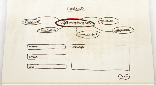
")
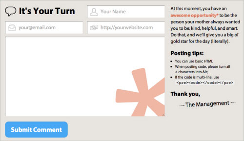
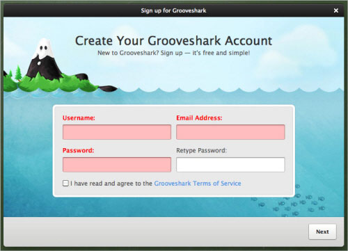
")
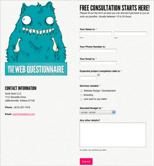


")
 (click to enlarge)")
")
")
")
")
")
")

")
")
")
")


 Choose Your Weapon
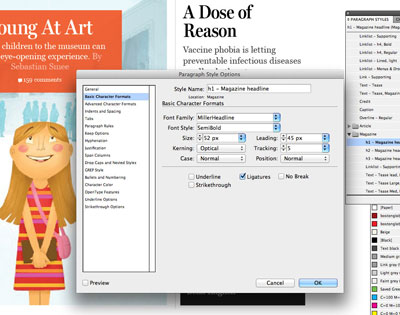 Time for a Breakdown


")
")
")
")
")
")
")
")

 Media Queries are where users come to websites for content (usually by many different means). We should strive to present this content in the most appropriate and readable way possible.


")
")
")
")
")
")
")
")
")
")
")
")
")
")
")
")
")
")
")
")
")


")
")
")
")
")
")
")
")
")
")


")


")

")


")

")


 - click to enlarge")

 - click to enlarge")


 - click to enlarge")
 - click to enlarge")
 - click to enlarge")


")

")


")
")
 (click to link article)")
")
")
")


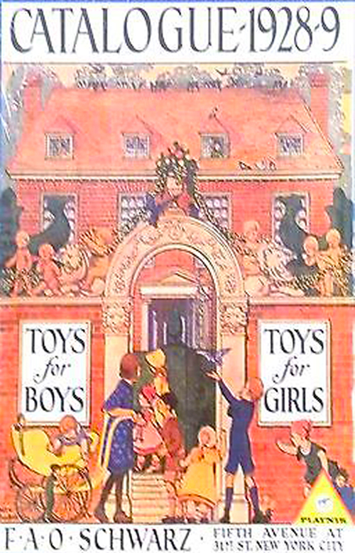


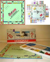


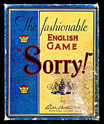

")
")


